 stephan hagemann
Borrowing from LessWrong

I mostly think about structure in software and in the teams that build it. What belongs together, what should stay apart, and why that's harder than it sounds.
I have long been a fan of the reading experience on LessWrong. Long posts there have a quiet outline next to them that tells you where you are. Links show you what’s behind them before you click. The whole thing runs on ForumMagnum, the open source forum software that also powers the Effective Altruism Forum. It’s one of the few places on the web where I read long things and don’t get lost.
A week ago, I gave this site a bit of that. Here is a post from last week before the change:
I have long been a fan of the reading experience on LessWrong. Long posts there have a quiet outline next to them that tells you where you are. Links show you what’s behind them before you click. The whole thing runs on ForumMagnum, the open source forum software that also powers the Effective Altruism Forum. It’s one of the few places on the web where I read long things and don’t get lost.
A week ago, I gave this site a bit of that. Here is a post from last week before the change:1
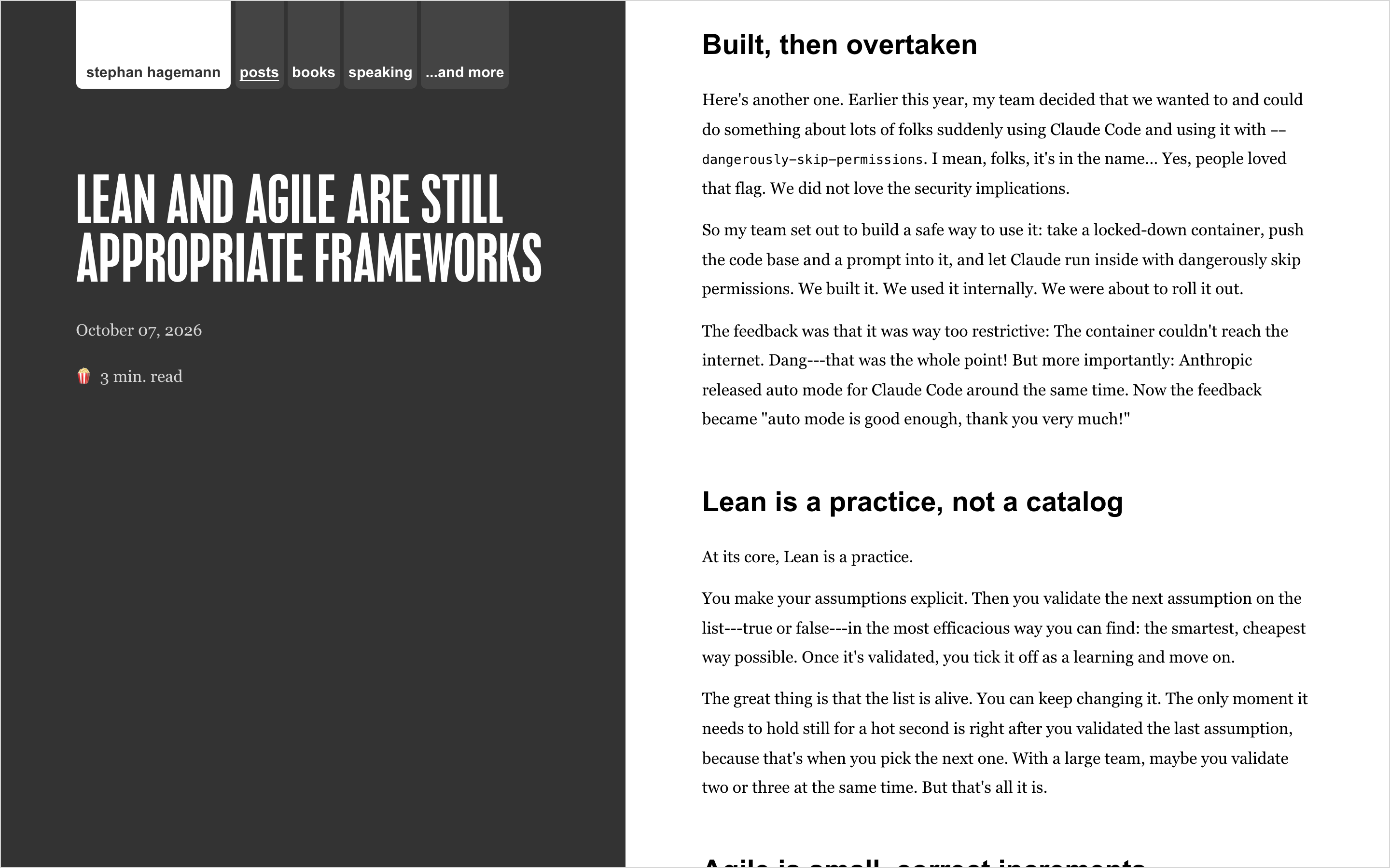
And here it is now:
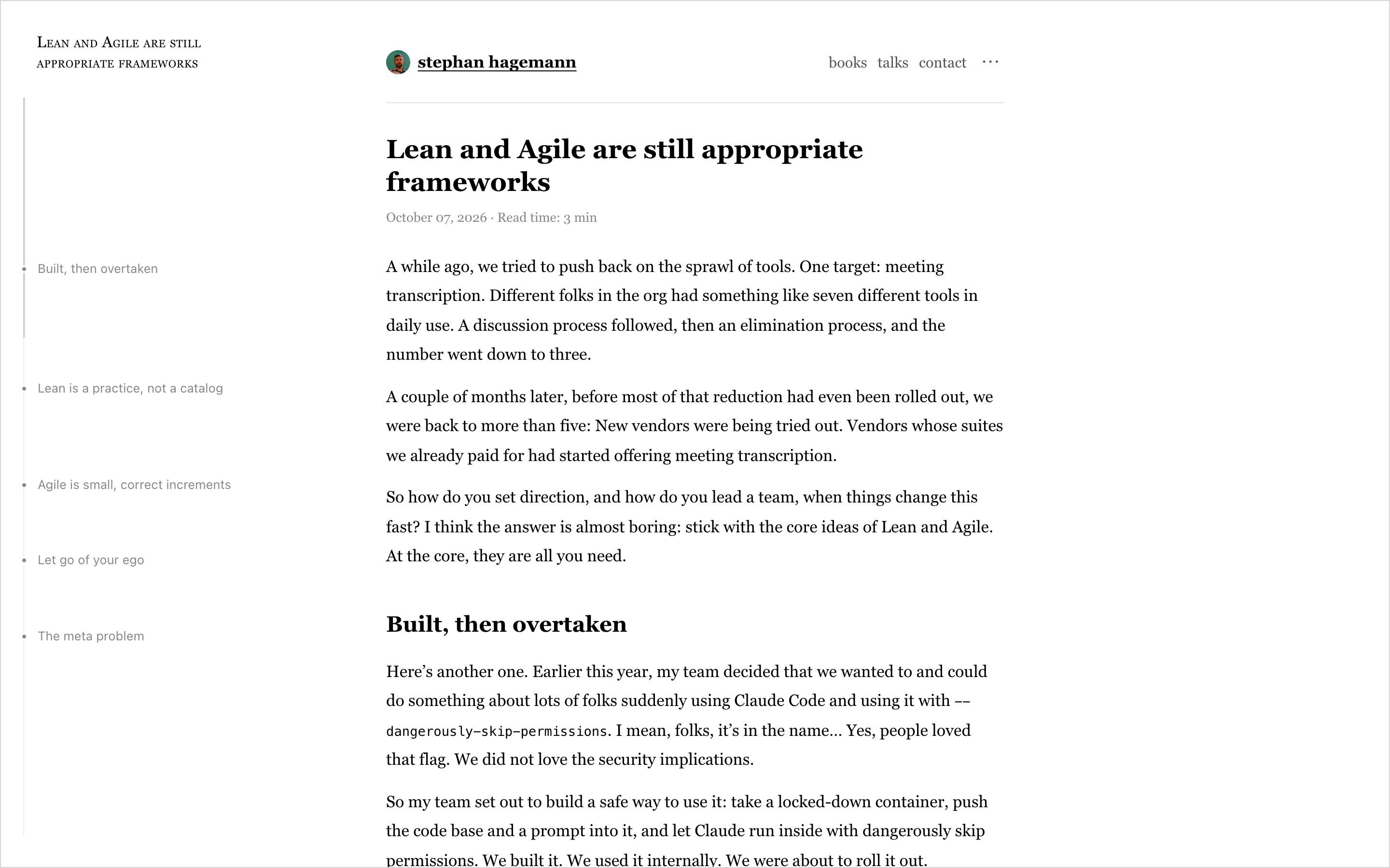
The rail#
On wide screens, posts now get a rail beside the text. It’s a faint line with a dot for each section. The dots aren’t evenly spaced: each one sits where its section starts, in proportion to the length of the post. A long section gets a long stretch of line.2 A darker stretch marks what’s currently on screen, so you can see at a glance how far along you are and how much is left.
Hover over the rail and the section titles show up. Click one to jump there.
When a post has replies, the rail keeps going: in the comments, it turns into the tree of who replied to whom. Conversations from the fediverse and Bluesky can branch quite a bit (I am not in any danger here, pretty sure), and it’s nice to see the shape of the whole thing at once.
Link previews#
I link to my own older posts a lot. Those links now carry a small “°” marker,3 and hovering one shows the post’s title, date, reading time and its opening lines:
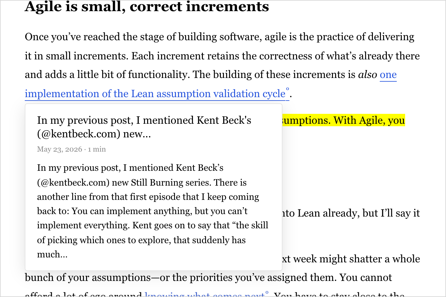
So you can decide whether to go down the rabbit hole… or not. Hovering an external link shows its address, so you know where you’d end up.
Section links#
Every section heading now has an id and, on hover, a “#” anchor. If you want to point someone at one part of a long post, you can link right to it:

Sidenotes#
I borrowed one more thing: footnotes now show up in the margin, right next to the line that points to them. They stay out of the way until you hover a note’s number. If you’re reading this on a wide screen, try it on the little numbers in this post.
Only on the page#
All of this happens only on the post page itself. The RSS feed, the fediverse and Bluesky get the same plain text as before. A reader in a feed reader or on Mastodon shouldn’t have to care about how this site looks.4
No new framework either: it’s a bit of server-rendered HTML, some CSS and one small script.
-
Strictly speaking, the “before” is two changes back. In late September, I had already traded the dark sidebar for a single column. ↩
-
Entries that would overlap get nudged apart, so the dot for a very short section can sit a little lower than it “should”. ↩
-
LessWrong uses the same little ring. ↩
-
The same goes for a browser without JavaScript: the page reads just as well, it just doesn’t get the outline or the previews. ↩
1



 by Stephan Hagemann